The post-New Deal Republican party has delivered endless strings of deficits and debt. That is their historic legacy to America, the bare fact on the ground that unfortunately requires endless repetition to impart the reality, and counter the tea-party fantasy of fiscally irresponsible Democrats.
Also required is a catchy moniker that encapsulates that reality:
Red-Ink Republicans
Use it. Everywhere. Make it a meme. Republicans are irresponsible profligates. We can’t afford them anymore. We’ve run their experiment. It failed. Disastrously.
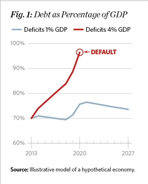
With the ever-vigilant likes of The Heritage Foundation continuing to promulgate debt/deficit hysteria using what they openly call “A toy economic model,” “a back-of-the-envelope calculation,” stating outright that “the numbers and events used in this model were made up” (they call themselves an academic think tank?), it seemed like time to revisit the big picture of American government debt and deficit since the last great depression.
Here’s the make-believe story Heritage wants to tell:
Here are the actual facts on the ground over eight decades:
In the 35 years following World War II, (some) Republicans and (mostly) Democrats steadily and responsibly reduced government debt from 130% to 45% of GDP. (And worth noticing: that 130% figure preceded two decades of the fastest prosperity growth in American history.)
Then came 1980. The Reagan/Republican revolution. Aside from a brief respite under Clinton, government debt has been heading rapidly north ever since.
Debt was reduced under every president since World War II, with three exceptions: Reagan, Bush, and Bush. (And Obama, who had the numerator, GDP, pulled out from under him before he even set foot in the oval office.)
Eighty years of history tells us one thing for certain: if you want to get debt under control, don’t rely on the Red-Ink Republicans.
Cross-posted at Angry Bear.

Comments
2 responses to “Red-Ink Republicans, Revisited and Reviled”
Yes, do a graph that shows public debt/GDP, with in the background some indication of when were the good years. And then add to that graph private debt/GDP and something that indicates the not-so-good years.
@The Arthurian
What you will see is that good times are associated with increasing private debt… but that when private debt reaches a high level it fails to increase at the pace associated with good times. And public debt runs pretty much the opposite course.
The increase in public debt after 1980 on your graph did not lead to good times, because the level of private debt remained too high to permit good times. Reaganomics provided only half a solution to the debt problem.
The economy has taken matters into its own hands, and deleverage now does agonizingly that which policy might have done with ease.