“Poor people today have air conditioners and smart phones!”
You hear that a lot. “You should be looking at poor people’s consumption, not their income. By that measure, they’re doing great.”
The basic point is very true. If poor people today have more and better stuff, can buy more and better stuff each year, maybe we should stop worrying about all those other measures that show stagnation or decline.
Does this measure tell a different story? Curious cat that I am, I decided to go see. I had no idea what I’d find.
The first thing I found: this simple data series isn’t available out there, at least where I could find it. Notably, the people who claim it’s so revealing don’t seem to have assembled it.
Consistent, high-quality expenditure data is available going back to 1984, from the BLS Consumer Expenditure Survey (CES). (Pre–2011 here. 2012 and after here. See “Quintiles of income before taxes.”) But you have to open a table for each year and pull out these numbers, which I did. The spreadsheet’s here. It’s simple, clear, and easy to work with, so please have your way with it. (Note: CES measures “consumer units” — “households” precisely defined for the purpose of measuring consumption. All the CES terms are defined here.)
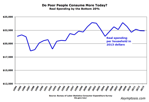
The household spending measure is in nominal dollars. I converted the values to 2013 “real” dollars using the BEA’s deflator for Personal Consumption Expenditures. Here are the results (mean values; medians would be somewhat lower).
By this measure poor people’s consumption is up 5% since 1984 — not exactly the rocket-ship prosperity growth for the poor that consumptionistas proclaim.
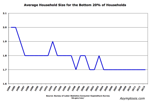
But truth be told, this isn’t a very good measure as it stands — because households have gotten smaller. For the bottom 20% that looks like this:
Declining household size means:
1. Per-person spending would trend up (if income per household is the same, with less people per household).
2. But: you have to adjust because living with more people is cheaper per person because of shared rent, utilities, etc. If you don’t, it looks like the average person in a four-person household consumes vastly less than a person in a one- or two-person household — which clearly isn’t correct.
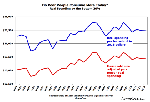
I corrected for that with the household-size adjustment method used by the Pew Research Center. This standard method is somewhat synthetic (more on that below), but it also clearly yields a more useful and accurately representative measure of poor people’s consumption. Here’s what those results look like:
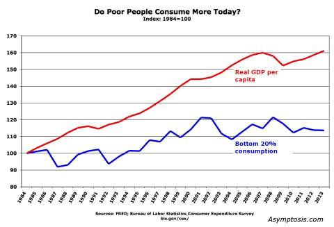
By this measure, things have gotten more better: poor people’s consumption is up 14% since 1984, compared to 5% using the other measure. But really, that’s still nothing to crow about; real GDP per capita grew 63% in that period — four times as fast.
More comparison: the real price of a share in the S&P 500 has increased 370% over that period. That’s not counting dividends.
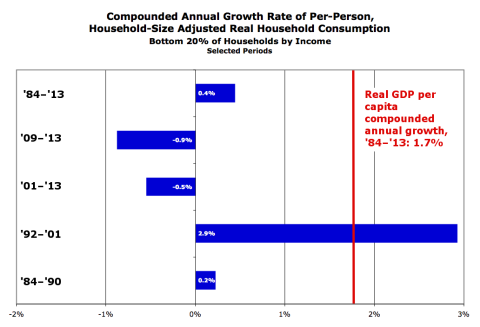
To get an apples-to-apples comparison, here’s a look at annualized growth rates for various periods:
Poor people have gained a little bit of ground in absolute terms. But they’ve lagged way behind the rest of the country. Growth in every period except the 1990s Clinton heyday was moribund or negative — notably ’84–90, the last twelve years, and (especially) the last four years of economic “recovery.”
The consumptionistas are absolutely right: this is a really good measure.
And it tells exactly the same story as the other measures.
No child left behind?
– – – – – – – – – – – –
Before I leave you, some proleptic responses to the predictable objections:
But, the Brookings study! Many point to this study (PDF) by the (liberal!) Brookings Institution. The study devises and tracks a measure they call “consumption poverty.” Here’s the money graph:

By this measure, very few people these days are living in “consumption poverty.”
Here’s the thing: this study uses the same data set you saw above. But you’re looking at it through a very synthetic lens: a somewhat-arbitrary “poverty threshold.” What percent of people are below that threshold? Which means you gotta ask: Is that a relative or absolute poverty threshold? How does it change year to year? How’s it calculated? Etc.
To say it another way: This measure is some calculation steps removed from — it’s a second or third or fourth derivative of — the data as measured by the BLS. I’m not saying it’s a bad or un-useful measure. I haven’t gone into the weeds with it. And Brookings tells you exactly how the threshold is calculated. But you have to understand the lens’s multiple assumptions and hold them in your head while you’re peering through the lens.
The graphs above, by contrast, are much closer to “the facts on the ground.” Assuming you’re interested in those.
Worth noting: the people who might prefer the story told by the Brookings poverty-threshold measure are the very same people who are forever complaining about measures that use arbitrary (and relative) poverty thresholds. Just saying.
The inflation adjustment misrepresents poor people’s reality. The “real” consumption spending in the graphs is also filtered through a lens: the BEA’s price index for personal consumption expenditures. What if that index is wrong? It is based on “hedonic” estimates, after all: what’s the value (as opposed to price) of today’s laptop compared to 1990’s? Cars are far more reliable than they used to be; knowing that your car will start every time you turn the key has real value. Air conditioning is more valuable than box fans. And think of all the free digital goods that poor people have access to now — from Google to online banking to… Those have no “pricing,” so they’re undercounted or uncounted in this measure.
This is basically saying, “you should create your own, different Consumer Price Index.” It’s exactly the same argument as the ShadowStats craziness, but in reverse: there’s not more inflation than is shown in the CPI, there’s less — more deflation. There’s a “true” index that’s misrepresented by the rather remarkable and diligent efforts of BEA statisticians.
Scott Sumner is rather the poster-child for this position. He says exactly this:
we should ignore all the official data, and use our eyes. Travel around the country. Go into poor people’s houses. … I think I do have a rough sense of the different sorts of consumption bundles purchased by different classes of people.
You should construct your own CPI index by holding up your thumb and squinting, eyeballing poor people’s consumption bundles. Because…the official CPI is not saying what Scott Sumner would like it to say.
Scott’s been going on about his superior CPI estimates for years. Karl Smith probably gave the best response, a year back:
basically anyone with MS Excel and a rudimentary knowledge of the subject matter in question can create a workable index…. a task that brilliant people have devoted their life to
The thing is, Sumner doesn’t even use a spreadsheet. He does it in his head. (Now that’s brilliant.) We should clearly do likewise, or just adopt his index — if we knew what it was.
Finally, note: the comparisons above — to real GDP and S&P growth — use the BEA’s GDP-deflator and CPI indexes, which are only slightly different from the PCE index used here for consumption. Almost-identical apples to almost-identical apples. Feel free to mess with that in the spreadsheet if you’re so inclined. It won’t get you much of anywhere.
The household-size adjustment is invalid. This is another lens interceding between you and the measured data, on top of the inflation adjustment. No doubt about it. But as with inflation adjustment, you can’t get around it. You can’t ignore shrinking household size any more than you can ignore today’s less-valuable dollars. And you can’t just divide household income by people per household, or people in four-person households look like they have vastly lower consumption than people in one-person households. That just isn’t reality.
One part you might reasonably question: The Pew size-adjustment methodology uses a chosen variable that can be from 0 to 1; they choose 0.5 based on some decent research over the years. I tried values between 0.1 and 0.9. Lower numbers lower and flatten the red line, and show a consistent upward trend from ’84 to ’01 (flat thereafter). But the basic story is unchanged.
– – – – – – – – – – – –
Look: no method is going to give you the perfect gauge of human well-being — the”obvious,” magic-bullet measure that conservatives seem to forever be after in their eternal Search For The Simple. This consumption measure is no exception. But advocates of this measurement approach are absolutely right: it’s much simpler and easier to measure than most other measures, and it’s a very good measure of how poor people are doing.
Bottom line: Poor Americans’ consumption grew, very slowly, over the past three decades. Meanwhile the rest of the country grew four times faster, and a typical stock-market investment grew at least 27 times faster.
Do with that what you will. Adjust your priors as appropriate, if that’s something you do.
Then take a look at some closely related measures that might tell other important parts of the big story:
How much of this picture is about young versus old? The population is aging; do we need to change the story this measure tells based on changing demographics?
Did poor people take on more debt to achieve that higher consumption? How has that affected their lifetime well-being?
How much of that consumption growth resulted from government spending, and how much from the market doing its job of allocating resources efficiently? (i.e., to those who will value them highly?)
Are poor people working more hours to get that consumption increase? Do they have more or less leisure and family time?
How economically secure are people? What is the typical person’s chance of falling into this bottom-20% consumption group? How has that changed?
I’ll try to address some of those questions in future posts.
Cross-posted at Angry Bear.
Comments
6 responses to “Are Poor People Consuming More than They Used To? Six Graphs”
If we’re getting overall reductions in major parts of the costs of living, and people’s spending on that stuff is relatively inelastic, then wouldn’t that show up as slower growth in overall consumption spending even if the quality of consumption and access to goods and services has improved?
Other than that, good work on teasing consumption spending out, and for acknowledging that it matters. I try to tell people that wages are only half of the issue of “living standards”, with the other half being costs of living.
This is a very interesting post, I’ll be following you in the future.
I would strongly suggest that you take a less combative and acrimonious tone, especially if you wish to convince people who are still open minded about these issues. For example, you seem to concede (?) that consumption might be a better indicator than income for thinking about the condition of the poor, but then you use the derisive term “consumptionistas.” These are complicated issues with many ways of looking at the data, and I think a little bit of humility is in order from all of us.
Of course if you are more interested in preaching to the choir, then ignore this advice.
@3rdMoment
Good point. When people go on about things without even looking at the facts on the ground, I get irate. Should control myself better. 😉
Objections I hear, including from Sumner, that you didn’t deal with:
“Sure, by dollar figures the growth in poor people’s consumption doesn’t look as good. But poor people all have air conditioners and cell phones and microwaves these days! The difference between being poor means you have a older model cell phone than rich people with the latest iPhone, and being poor means you have no phone while rich people do is a huge difference! Then being poor meant going without meat and eating sweet potatoes; now it means having to have McDonalds meat instead of fancy grain-fed free range expensive meat! There’s a bunch of expensive status goods that rich people spend their money on, but they’re not *that* much better than the cheaper stuff, not like it used to be. The dollar figures reflect dollar income, not a real measure of consumption.”
“How much of this picture is about people spending longer in school, and more time as poor students?”
“Yes, poor households are doing worse, but that’s really because of marriage! The changes in household composition are greater than mere household size would imply, because if you replace a two adult household with a single mother household, that’s a big difference! It’s a problem, but it requires different remedies.”
@John Thacker
Your first objection is exactly the one I address; you’re basically asserting that CPI gets it wrong. If you can point me to an index denominated in “utils” instead of dollars, I’d love to see it.
Your second question on age (and associated, school time) is an excellent one, part of the whole age issue. I looked at that for household net worth here:
http://www.asymptosis.com/sense-on-stilts-eight-graphs-showing-a-quarter-century-of-wealth-inequality-and-age-inequality.html
Would love to see somebody do likewise for consumption expenditures.
The marriage issue doesn’t change the consumption measures and changes shown here. Moving to another subject, it might explain (some or much) of those changes. But even to the extent it does, the question of “remedies” is yet another stage removed from simply looking at these measures and how they’ve changed. Important stuff. But I don’t think failing to address it (and a zillion other things) detracts from the basic information imparted in this post.
[…] Are Poor People Consuming More than They Used To? Six Graphs Asymptosis (KF). […]