Now that the OECD has updated their GDP data for 2010, I thought I should revisit the question I asked a few years ago:
Who’s growing faster? The U.S. or Europe?
The answer’s the same as it was then: it’s a dead heat.
As I pointed out in that previous post, people love to cherry-pick periods and show how the US has grown so much faster than Europe. (Funny how liberals don’t seem to play this particular game, while conservatives do, quite constantly — usually while going all gooey about people named Reagan and Thatcher.)
The problem is, what they’re saying isn’t true.
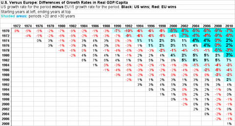
Being a curiously curious cat, with an apparently blithe disregard for my own mortality, I went out and looked at the changes in real (inflation-adjusted) GDP per capita over the last forty years. Which I share with you here. Feel free to cherry-pick at will.
(Click for larger.)
Example, for the upper-right cell:
| Starting Year | 1970 |
| Ending Year | 2010 |
| EU Starting GDP | $14,462 |
| EU Ending GDP | $30,590 |
| US Starting GDP | $20,544 |
| US Ending GDP | $41,976 |
| EU Change | $16,128 |
| US Change | $21,432 |
| EU Change % | 112% |
| US Change % | 104% |
| Change difference subtractive | -7% |
| Change difference percent | -6% |
In the 40 years between 1970 and 2010, real GDP per capita grew by 112% in the EU15, and 104% in the U.S., for a difference of 8%. (Rounding results in 7% showing here; I chose not the display the extra digit everywhere because it makes the table hard to scan easily.)
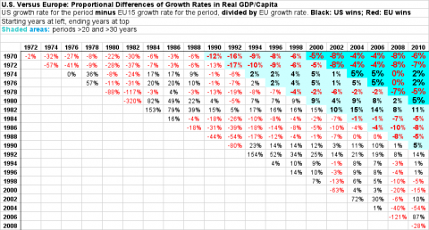
It’s also easy to show how much growth rates varied proportionally to each other, by percent (the difference between the US and the EU growth rates, divided by the EU growth rate; that’s “Change difference percent” in the last row above).
This is a useful comparative, but it can result in showing big (and rhetorically spurious) swings for short periods, swings that smooth out as soon as you look at periods longer than even six or eight years. Scan along the bottom diagonal horizon and you’ll find no shortage of wonderful cherry-pickable moments. Have at it.
But if you’re actually curious about how our different economic models play out over decades — which is what we do or at least should care about — look to the upper right. I’ve highlighted periods greater than twenty and greater than thirty years for your viewing pleasure.
If you can see any kind of long-term pattern anywhere, I’d be delighted to have it pointed it out to me. The average for those upper-right, dark blue cells is -2.6%, meaning that over the long run, U.S. growth shows as 97.4% of the EU15’s — well within the statistical noise.
Also note that the new data for this post — the right column, for 2010 — seems just as random as all the rest. (Though the two bottom cells do provide some juicy numbers, which I’m sure commenters can spin out into an endless and truly fruitless and specious series of arguments. You go girls.)
Speaking of statistical noise, even though this is about the best national-level data we’ve got (we have to use some data to make our judgments), there’s inevitably some messiness in here. So for the curious and/or skeptical, here are the details.
The data is from stats.oecd.org. The OECD — a think-tank cum rich-country club — assembles this data from individual countries’ national accounts. (They just updated US 2010 GDP in March.) They also compile it to some extent, and apply various conversions using best practices. Viz:
For comparison to the U.S., I used the OECD’s compiled data for the 15-country European Union (Austria, Belgium, Denmark, Finland, France, Germany, Greece, Ireland, Italy, Luxembourg, the Netherlands, Portugal, Spain, Sweden and the United Kingdom). In my previous post I used a simple average of GDP/capita for non-English-speaking Western European countries (excluding Luxembourg and Norway, for instance, because of size, banking, and oil). I think that selection provided a better representative comparison group, but the OECD does a better job of agglomerating the data than I could do. I’ll just say that judging from my non-systematic journeys through the data over the years, changing country choices doesn’t change the top-line results much at all. Please feel free to prove me wrong.
I chose GDP/Capita as a measure because it’s a pretty good big-picture yardstick of prosperity, and removes one key confuting variable from the comparison: population growth over the decades. GDP has lots of things wrong with it (it only counts remunerated work, for instance, which gives the U.S. a notable advantage in the comparison, because Europeans have more free time for productive but unremunerated “home work”), but it’s hard to name a better big-picture measure for which we have consistently compiled data for lots of countries, going back four decades.
All the foreign numbers are converted to US dollars based on “purchasing power parity.” This adjusts for different purchasing power in different countries, in an effort to impart people’s relative buying power in those countries. It’s not a perfect method, by any means. But just using market exchange rates isn’t either. Since I’m curious about standards of living in the two areas, PPPs made more sense than exchange rates.
Adjusting for inflation — especially in different countries — is also an imperfect science. Many European countries, for instance, don’t use “hedonic adjustment” to correct for massively increasing computer value per euro or dollar. (This makes those countries’ growth rates look worse.) The U.S. and several other European countries do. I’m not a ShadowStats fan (CPI tracks too closely with the Billion Price Index, for instance, to give much credit to their rather wild claims), but I do realize that adjusting for inflation requires holding up your thumb and squinting some. Again, though, if we want to compare countries’ prosperity over decades, we need to talk about real buying power as opposed to nominal units of currency.
Those were my choices. If you think there are better ones, and that they would change these results significantly, please go do it yourself and report back. I’m wildly curious. Here’s my spreadsheet. I’m happy to help anyone figure out how to use it (the Data Tables are especially neat), and also how to navigate the OECD’s stats.
I should end by pointing out the fact that commenters will undoubtedly raise: the EU remains way behind the U.S. in (at least) this measure of prosperity. Europeans buy 20-30% less stuff per person than Americans. After catching up fast (and predictably) in the decades following WWII, they’ve been stuck at about the same level (relative to us) for forty years. Standard economic convergence theory suggests that they should have continued that catch-up. But that’s a topic for another post.
Cross-posted at Angry Bear.


Comments
12 responses to “U.S. Versus Europe: Who’s Winning Now?”
[…] Cross-posted at Asymptosis. […]
Imagine your counterpart in Japan comparing similar data in the late 1980’s , or even in the early years after their double-bubble popped. He would have been crowing about what a world-beater the Japanese economy was. Now , after 20 years of slow growth , they’re still burdened by most of the crushing debt load that caused the crash in the first place.
Until someone figures out how to correct GDP growth levels to a constant debt/gdp level , all such comparisons are suspect , and that covers a whole lot of the last few decades of economic literature. Sweeping conclusions about developmental economics , effects of inequality and other factors on growth rates , etc. , have been made based on faulty growth data.
Pre-1980 or so , total nonfinancial debt/gdp was relatively constant in the U.S. I suspect the same was true for many of the advanced Western economies. You can probably safely rely on growth figures through that era. However , after Anglo-style financialization spread worldwide , with attendant surging debt/gdp levels , more in some countries than in others , the numbers are going to be shakey. Even a subtraction of only a few tenths of a percent from annual gdp growth ( to correct for constant debt/gdp ) would become quite significant with compounding.
@Marko “Until someone figures out how to correct GDP growth levels to a constant debt/gdp level , all such comparisons are suspect”
Very true. It’s really stunning how little attention this gets. Keen is making a stab at it, but mainstream economics still doesn’t seem to have any decent model. I also think the relationship between trade balances and capital flows, relative to domestic debt levels, is seriously under-theorized.
A couple of aspects here: Even if one accepts conservative arguments about the impact of one would not expect it to affect long term gowth. Just for the sake of argument (making figures up here), say increasing tax burden by 10% of GDP results in 1% reduction in labor force participation rate. One would expect it to be a one off effect, not compounded indefinitely until participation rate approaches zero (asymptotically of course).
I think the impact on figures like hourly productivity to be more significant, and there for the most part there are clear differences.
Another aspect of Europe one must keep in mind is that its tax system is actually quite regressive relative to the USA – lower income people pay higher taxes than their American counterparts, (and yes, for many people, this is more than compensated for by the benefits they receive.) This means, to understand US and European differences better, one needs to examine the impact of higher taxes on the non-rich. A shift to home production would make no senses for higher income people, a 90% marginal tax rate is not going make a hedge fund managers decide to mow their own lawn instead of paying someone else. Lower down the income ladder a shift to home production is a reasonable response to higher taxes.
[…] Update June 2012: See data through 2010 here. […]
[…] far more convincing demonstration, in my opinion, is this: comparing the U.S. to Europe over forty […]
[…] Here’s one example looking at multiple periods and multiple lags, comparing European growth to U.S. growth (click for larger). […]
[…] Here’s one example looking at multiple periods and multiple lags, comparing European growth to U.S. growth (click for larger). […]
[…] welfare but still has a slight edge in wealth and GDP growth over the US. Strange isn't it? http://www.asymptosis.com/u-s-versus…nning-now.html http://www.asymptosis.com/europe-vs-…s-winning.html Below we cab see that from 1972 to 2010 the […]
[…] 50% got the right answer, and those who got it wrong were evenly […]
[…] The most immediate and obvious (but not inevitable) conclusion from this fact is that Democratic policies are economically superior; they result in faster growth and more prosperity. At the very least, it’s unequivocal that in advanced, prosperous countries over many decades, more taxes/government spending do not result in slower growth. […]
[…] The most immediate and obvious (but not inevitable) conclusion from this fact is that Democratic policies are economically superior; they result in faster growth and more prosperity. At the very least, it’s unequivocal that in advanced, prosperous countries over many decades, more taxes/government spending do not result in slower growth. […]