I really love it when somebody points out that I’m wrong. (At least, when they’re right that I’m wrong.)
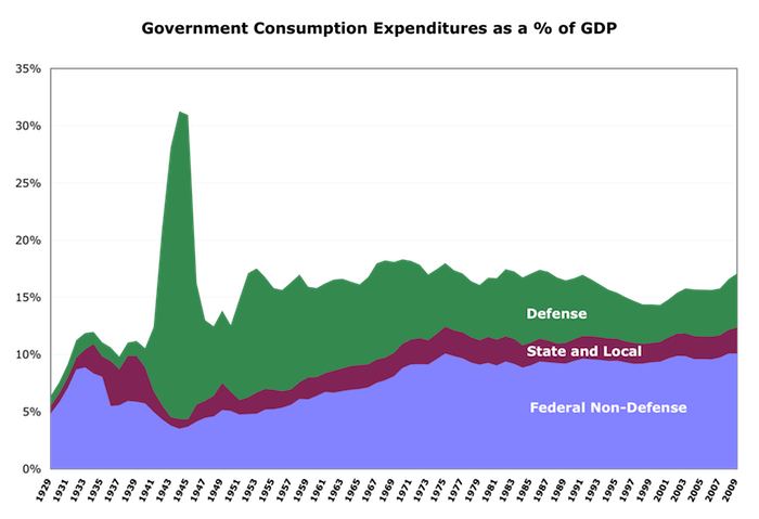
Jazzbumpah in an email pointed out a whopper of an error in a previous post, in this graphic:
The blue slice is State and Local. The red slice is Federal.
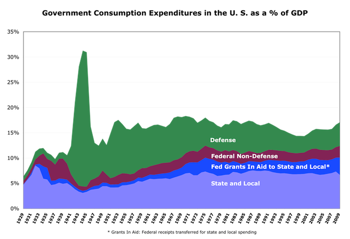
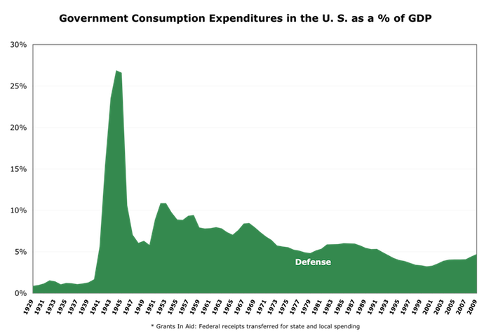
Here’s the real picture:
(Expenditures: NIPA table 3.9.5, lines 12, 17, and 22; GDP: NIPA GDPA. Grants in aid: http://research.stlouisfed.org/fred2/series/AFGSL/downloaddata?cid=107)
Reminder: government consumption expenditures is government expenditures minus outlays for social-insurance programs like Social Security, Medicare, etc. (they’re insurance programs that happen to funnel the money through the government), and minus government investment in fixed assets. As Tyler Cowen points out, it’s the best measure of what government is actually “spending” — what it delivers in government services.
We’re so used to believing the “massive federal government” meme that even while staring directly at the data I misinterpreted and misrepresented it.
This also prompted me to add an important slice that I’d thought of before, but hadn’t included: federal transfers, or “grants in aid” to state and local governments. This is money that is taxed at the federal level, but transferred to state and local governments for spending — usually with strings attached. (Largely based on the “locals know their needs better” meme — which may be true.)
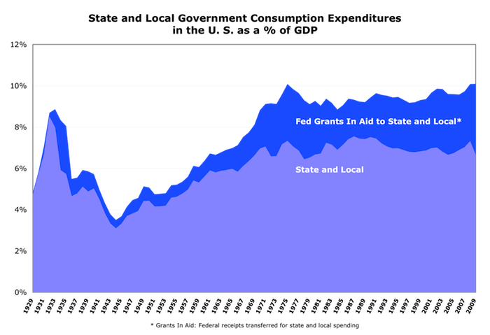
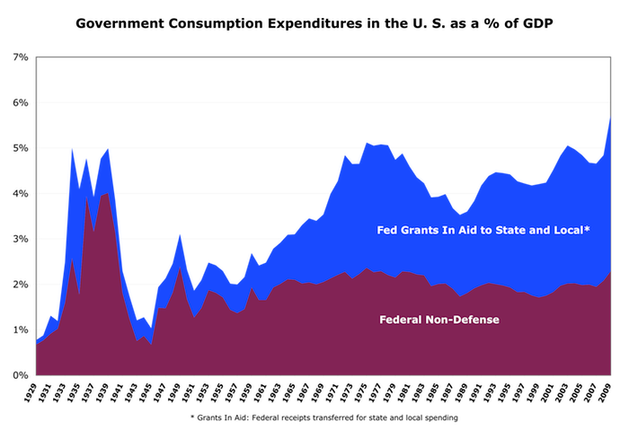
Since (as Jazzbumpah again pointed out) stacked area charts can be hard to read, here are a few slices broken out for you:
Notice that grants in aid tend to compensate for the business cycle/state of the economy. When times are bad and state and local budgets (most of which are required to be balanced) are strapped, grants in aid smooth things out and provide for those who are hurt by the down economy. In other words, they’re “countercyclical” — which is a good thing both for the economy as a whole and for individuals.
Long story short, government consumption spending has been basically flat since the 70s. The notion of massive runups is delusional. (Yes, we need to control health-care costs that are overwhelming our economy and our government budgets [Medicare and Medicaid]. That’s a different issue. Also pension plans. Social security really isn’t an issue at all.)
As always, I’m happy to share my work. Drop a line if you want the spreadsheet.
Comments
3 responses to “Government Consumption Spending Revisited”
Note that grants in aid grew until about ’76, then leveled, right along with other non-defense spending.
I sliced through it differently.
http://jazzbumpa.blogspot.com/2011/01/government-spending-and-great.html
Here is my generalized take:
1) Taxation was reduced since 1980.
2) Spending growth was reduced since 1980.
3) Spending with adequate taxation (e.g. before 1980) never led to a deficit problem.
4) Since 1980, spending (specifically on destructive enterprises) without adequate taxation has lead to faltering GDP growth, the current staggering unemployment, social instability (Tea Party, I’m looking at you) due to grotesque wealth inequality, and misapplication of resources from productive enterprises to speculative churning and rent-seeking, specifically enabled by grotesque wealth inequality.
5) Therefore, deficits result from a) military (not social-program) spending and b) inadequate revenues caused by i) insufficient tax rate percentage on high wealth, and ii) current recession-depressed taxable earnings.
Let me know what you think.
I haven’t read this post yet, but on a quick glance, it seems to be going after a lot of the same stuff.
http://www.econbrowser.com/archives/2010/10/the_everexpandi_1.html
Cheers!
JzB
[…] Update! See corrected graphs here. […]